2x Grid
The IBM grid is the framework for all the visual elements and typography. It’s fundamental to everything we design. No matter what device or medium you’re working with, the grid gives you just enough structure and guidance so you can focus on your creative idea.
- Divisions of two
- Constructing the 2x grid
- Base unit
- Spatial relationships
- 2x Grid in UI
- 2x Grid for video
Divisions of two
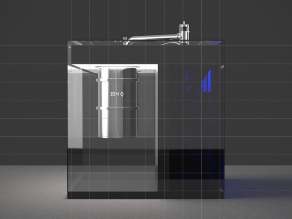
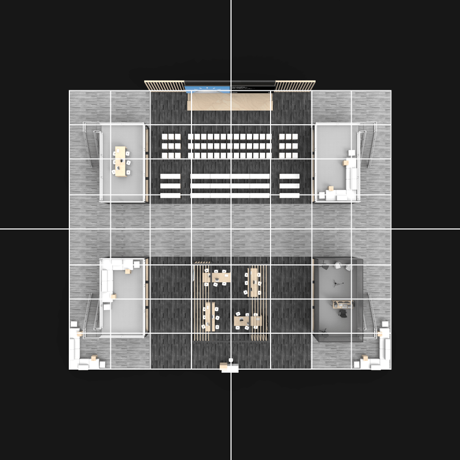
At the core of the 2x Grid concept is the idea of divisions of two. This can be applied to most surfaces, 3-D objects, and architecture as a means to divide space into a helpful grid system. Dividing your space into 2, 4, 8, 16, 32, or 64 columns gives you the basis of the system with the purpose of helping you make decisions and organize your content.
Constructing the 2x grid
Each application of the grid can require a different grid structure. When constructing the grid, keep in mind these different types of grids and choose which one best serves your need.
No margin or gutter
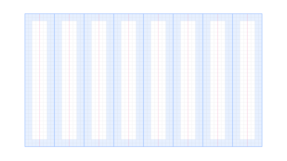
Margin with no gutter
Margin and gutter
Margins
Add margins to your canvas when you need separation of content from the canvas boundaries. In some cases, margins are specified by the production method.
2x Grid constructed with margins
2x Grid without margins
Columns and rows
Within the grid, columns and rows are especially important—they give layouts their structure. You can choose between 1, 2, 4, 8, and 16 divisions. Stick to your choice throughout your design to maintain structure.

Columns only

Rows only
Columns and rows
Always divide the live area to ensure equal column and row widths.
Never divide from the canvas boundary when using a margin.
Gutters
Add gutters to columns and rows when additional space is needed to separate content. When using gutters, always align type to the gutters rather than the canvas divisions. Columns and rows must always remain equal.
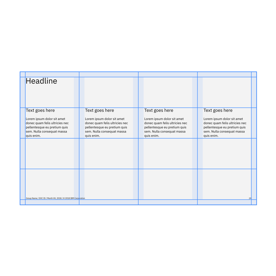
With gutters
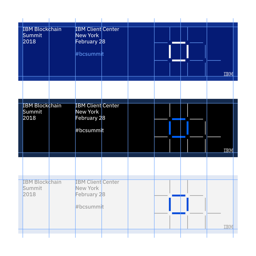
Without gutters
Distribute gutters evenly to achieve equal columns and rows.
Don’t add gutter to the canvas divisions without redistributing.
Base unit
If the 2x grid gives your designs structure, base units give them precision. Using a base unit will establish relationships between your grid proportions, typography, dimensions of shapes, and space between elements. You can choose either the mini unit or a baseline unit to build your grid and spatial relationships.
The mini unit
The mini unit can vary in size depending on the media. When choosing an appropriate unit for your application, consider the viewing distance. Each mini unit in the scale below has a type scale pairing and was determined by legibility over distance.
Mini unit sizes based on viewing distance:
| View distance | Mini unit | Media | Minimum Type Size (caption) |
|---|---|---|---|
| 0–0.5m | 2mm | Handheld print | 6pt |
| 0.5–1m | 4mm | Print viewed within arm’s reach | 12pt |
| 1–2m | 8mm | Posters and small signage | 24pt |
| 2–4m | 16mm | Human-scale print | 48pt |
| 4–8m | 32mm | Print viewed from across a room | 96pt |
| 8–16m | 64mm | Print viewed from across a street | 192pt |
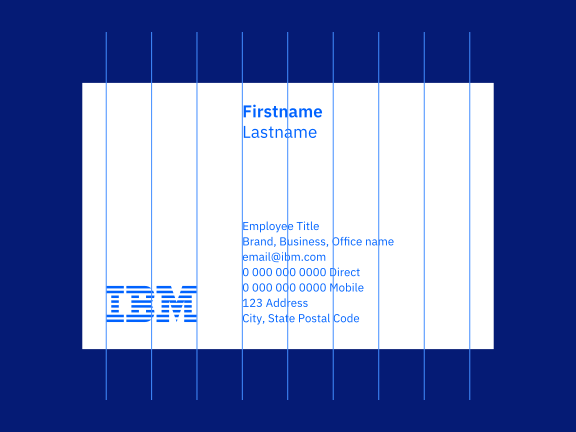
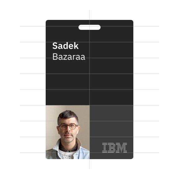
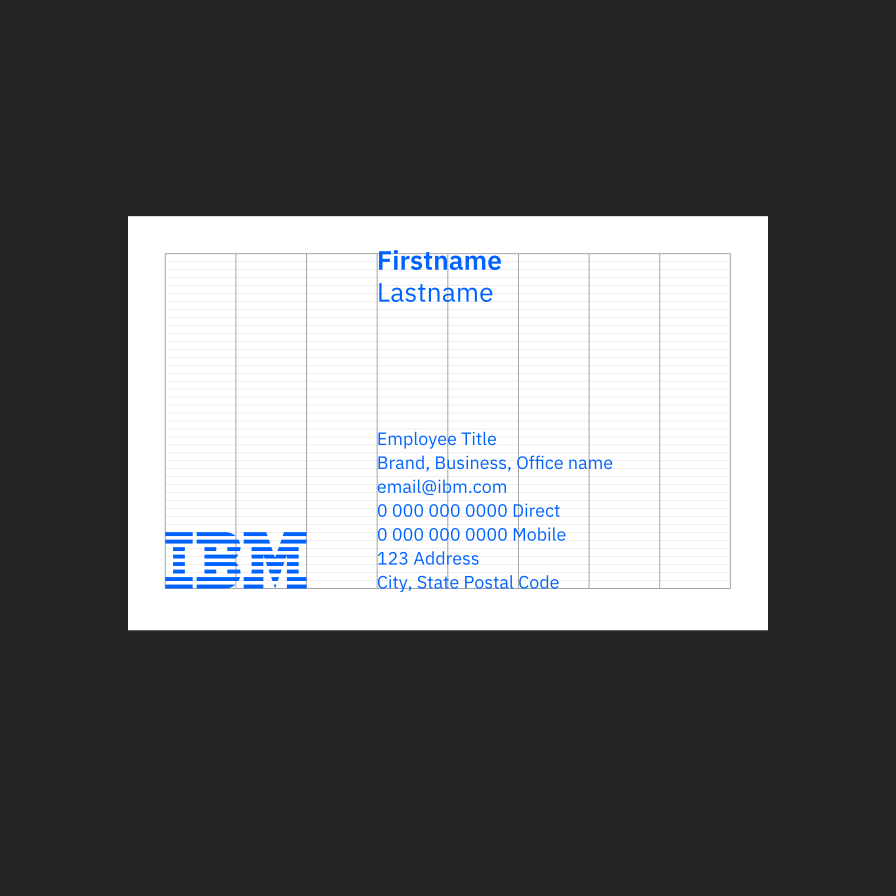
Handheld card—2mm mini unit
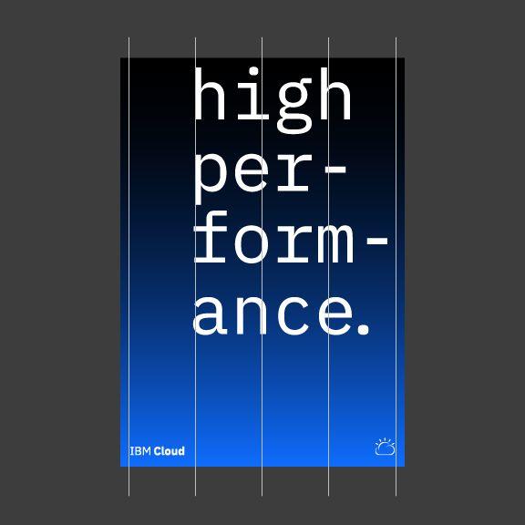
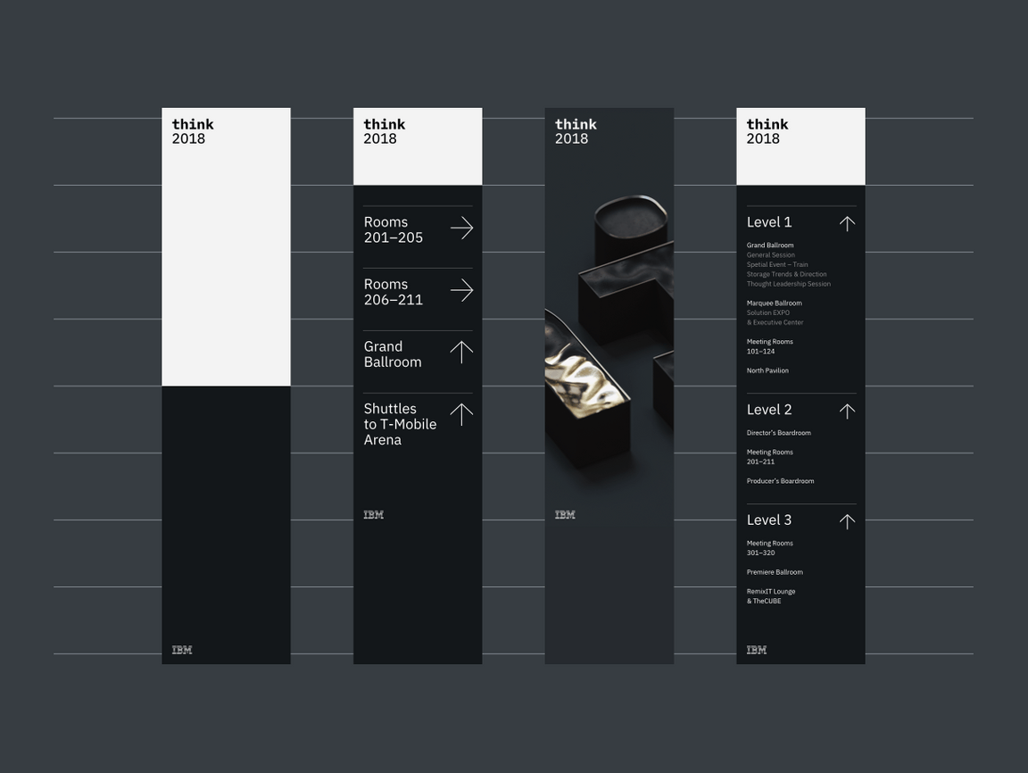
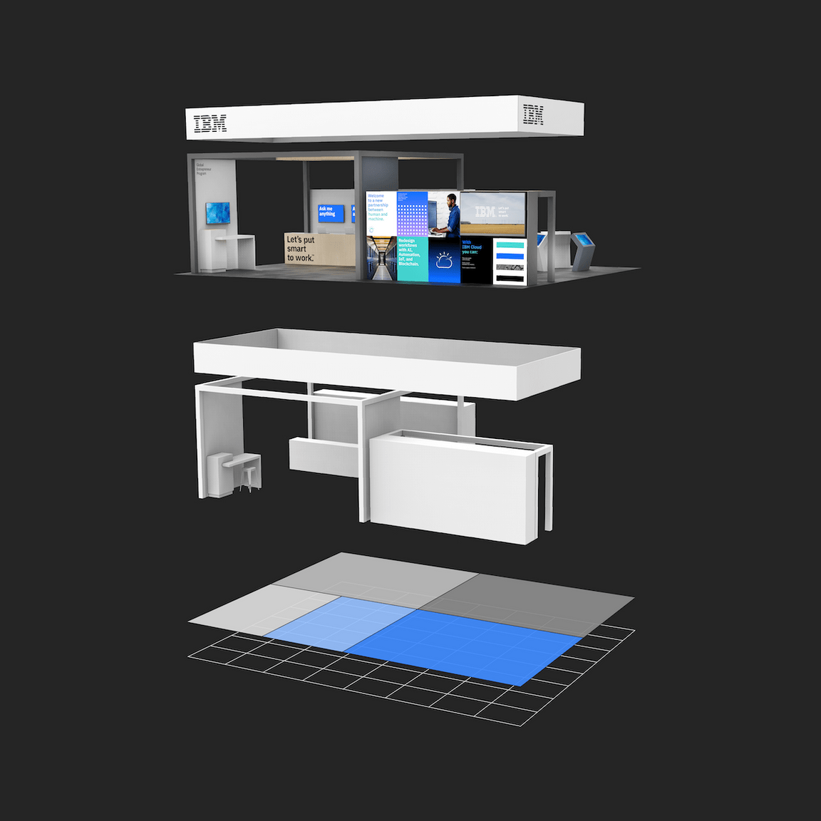
Standing banner—16mm mini unit
Billboard—256mm mini unit
Grids above viewed at intended distance—all mini units have the same apparent size.
Mini unit for product and web
The 8px mini unit guides everything in both software product and web environments, from the construction of the grid to all the elements that live within it.
Baseline unit
For advanced typographic layouts, consider creating a base unit from the leading of your document. You can use the leading size or a fraction of it to determine the baseline unit. Although this method requires finer tuning of margins, gutters, and type specs, it can help establish vertical rhythm and typographic harmony throughout your design.
The baseline unit can be used to construct all of the grid proportions, or you can take a hybrid approach by using the mini unit to create your grid and a baseline grid to guide your content.
Baseline unit grid
Hybrid mini unit grid with baseline
Spatial relationships
All spacing between elements can be defined by the base unit. Use the following multiples of your base unit to construct your layout: 1x, 2x, 3x, 4x, 6x, 8x, 10x, 12x. Consistent and replicated use of spacing ensures spatial rhythm between all content.
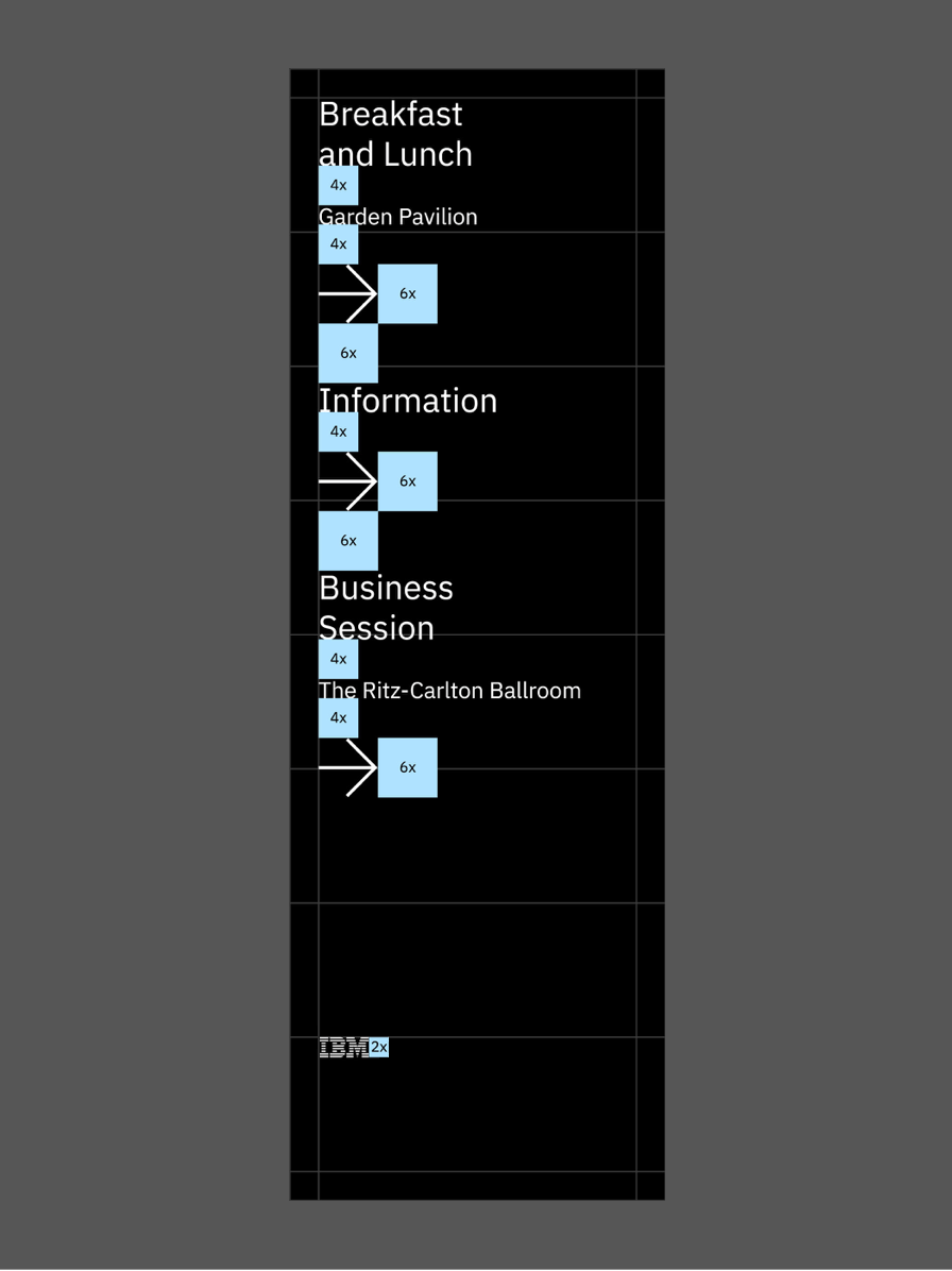
Standing Banner (mini unit)

IBM Letterhead (baseline unit)
Aspect relationships
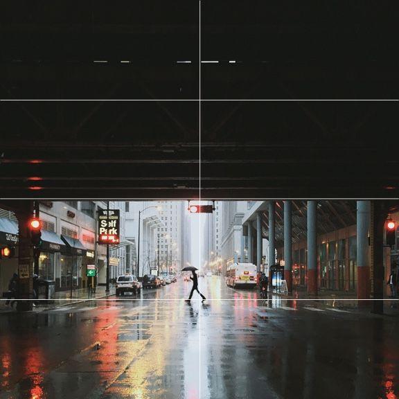
Use common aspect ratios, such as 16:9, 4:3, 3:2, 2:1, and 1:1 for images and containers. Always measure the width to the columns; the height is determined by it.
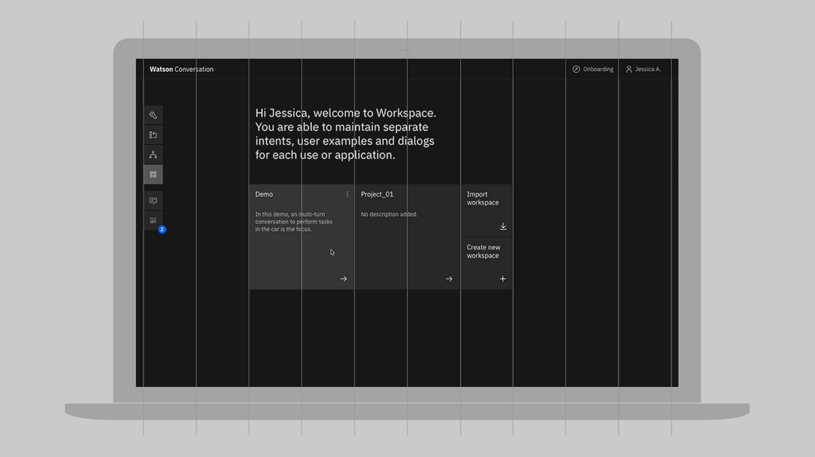
2x Grid in UI
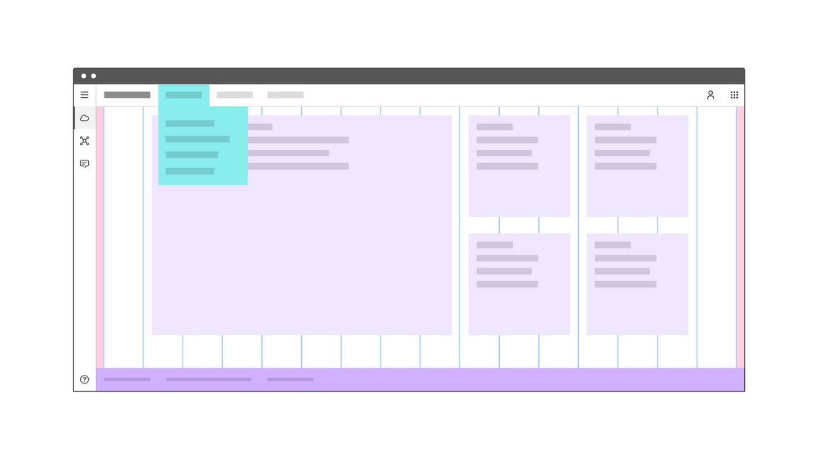
For detailed guidance on how to apply the 2x Grid system to products and user interfaces, please visit Carbon Design System.
2x Grid for video
A unique application of the 2x Grid has been derived for the standard 1920x1080 video format. Due to these fixed dimensions and aspect ratio, there is a fundamental mini unit of 7.5px which allows for perfectly even divisions of the grid at 30px intervals.
The 8 column structure pictured below will be sufficient for most layouts. If required, the canvas can be futher subdivided into 16 columns. It is recommended to have all elements ‘snap to grid’ with 30px increments in order to ensure proper alignments within the overall layout.
