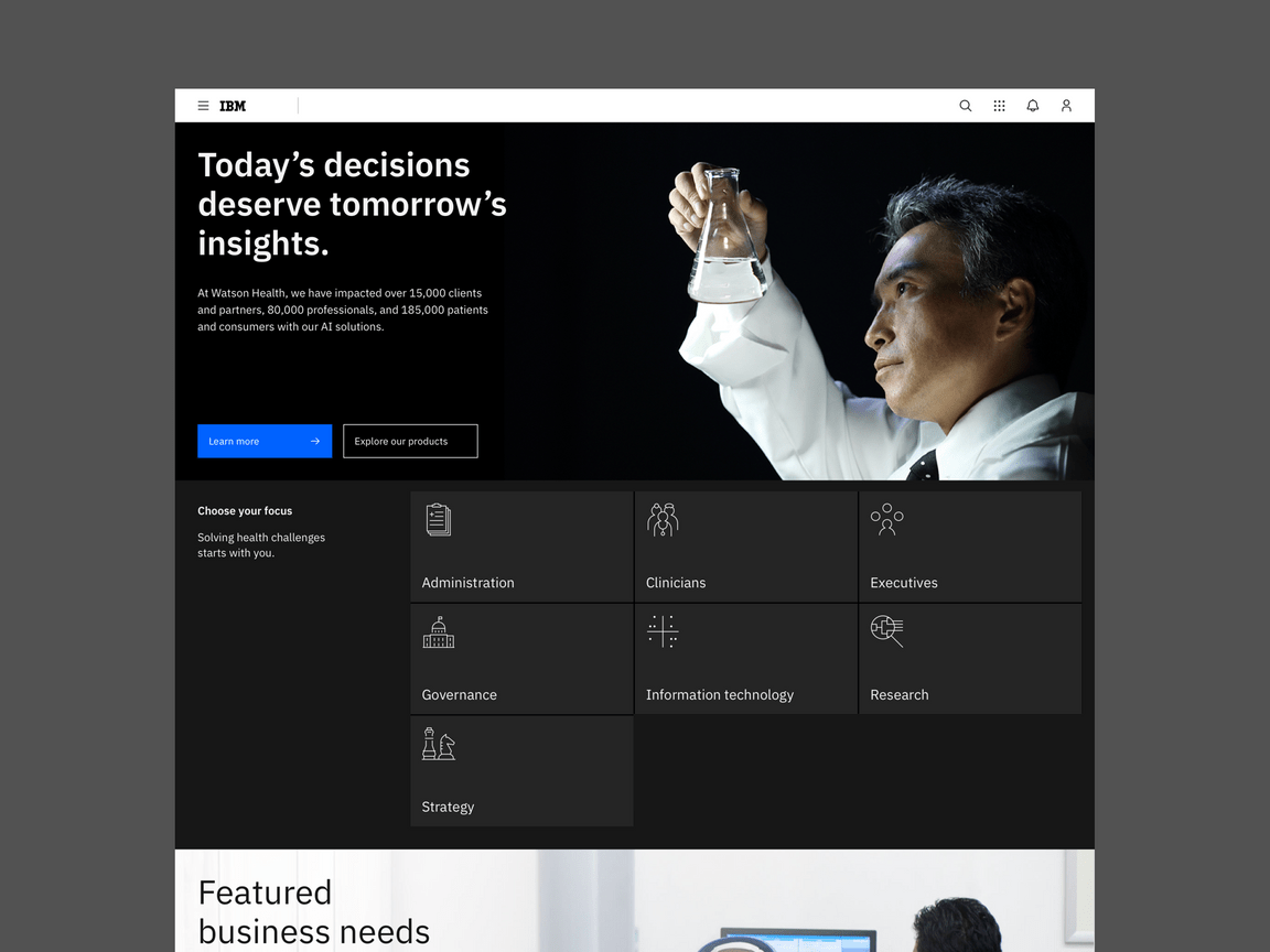
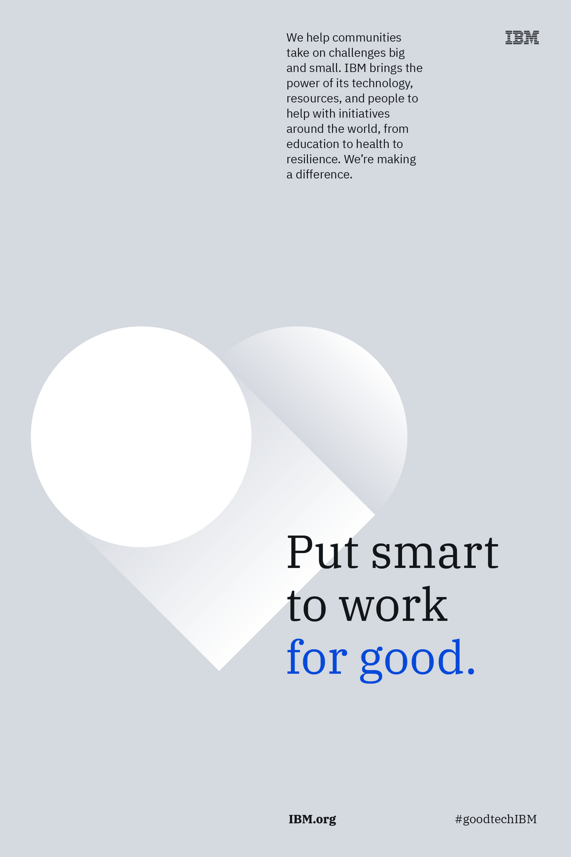
Tips and techniques
Layout creates a context for communication on a page. Using the right composition helps guide a user through content in meaningful, useful and beautiful ways. The tips and techniques found here can help you organize and manipulate content for a successful user experience.
Make and break patterns
In many ways, composition in design is very similar to musical composition. Melody, rhythm, harmony, timbre, and form—among others—are principles that can be translated across both fields. Like music, design is also driven by a careful balance of repetition and variation to create unity and interest.
Is it too repetitive and predictable? Is it too chaotic and lacking in structure? How do the elements relate to each other as well as the surrounding space?
Logical repetition of elements, measurements, shapes, ratios, and proportions will drive consistency and quality. Expressive variation—where appropriate—can break expectations and create visual interest.
Structural rhythm
When it comes to rhythm, what’s not on the page is just as important as what is. Consider a measure of music; repetition of notes without structure does not provide good rhythm. However, once notes are placed at regular time intervals, rhythm emerges.
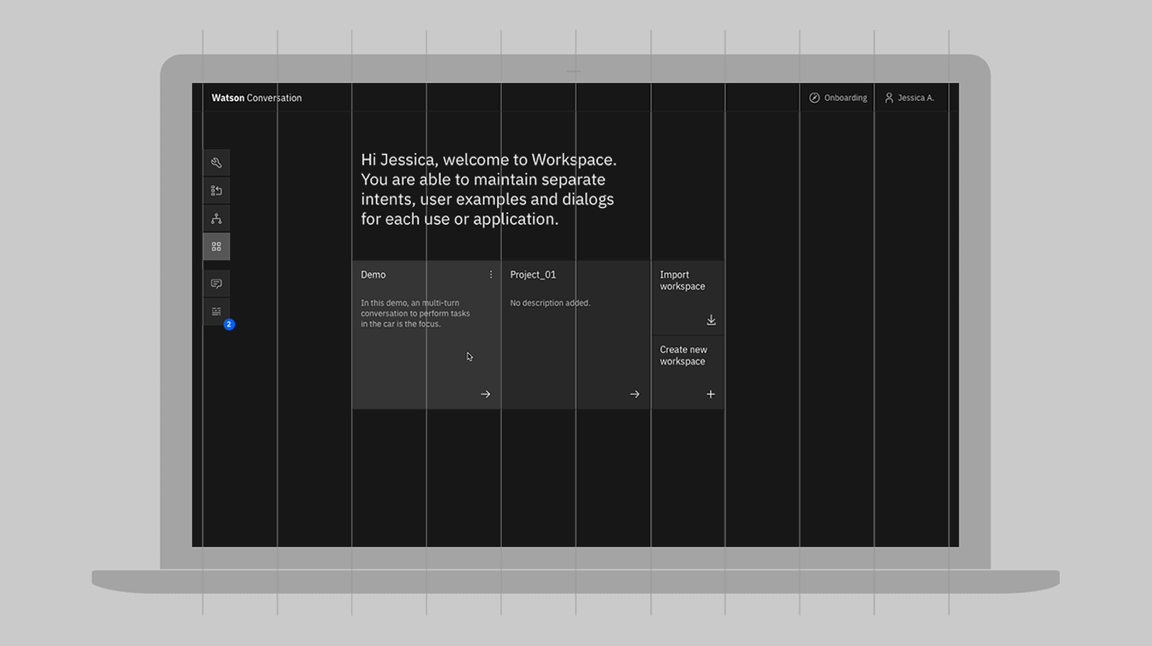
2x Grid
The 2x Grid is the scaffolding on which IBM designers create structural rhythm. It provides structural, proportional, and spatial guidance for design within any media. Skillful use of it will yield harmonious spatial relationships between canvas and content while expressing our distinct point-of-view.
Sizing scale
In lieu of concrete vertical divisions, such as on a web page, the sizing scale is helpful in establishing vertical rhythm. Like a type scale, the sizing scale constrains the range of sizes to improve consistency and rhythm, while still allowing a wide range of sizes.
Editorial rhythm
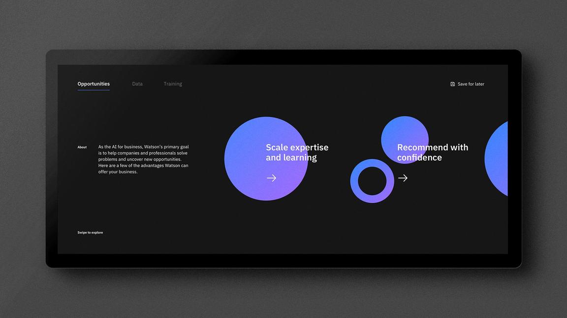
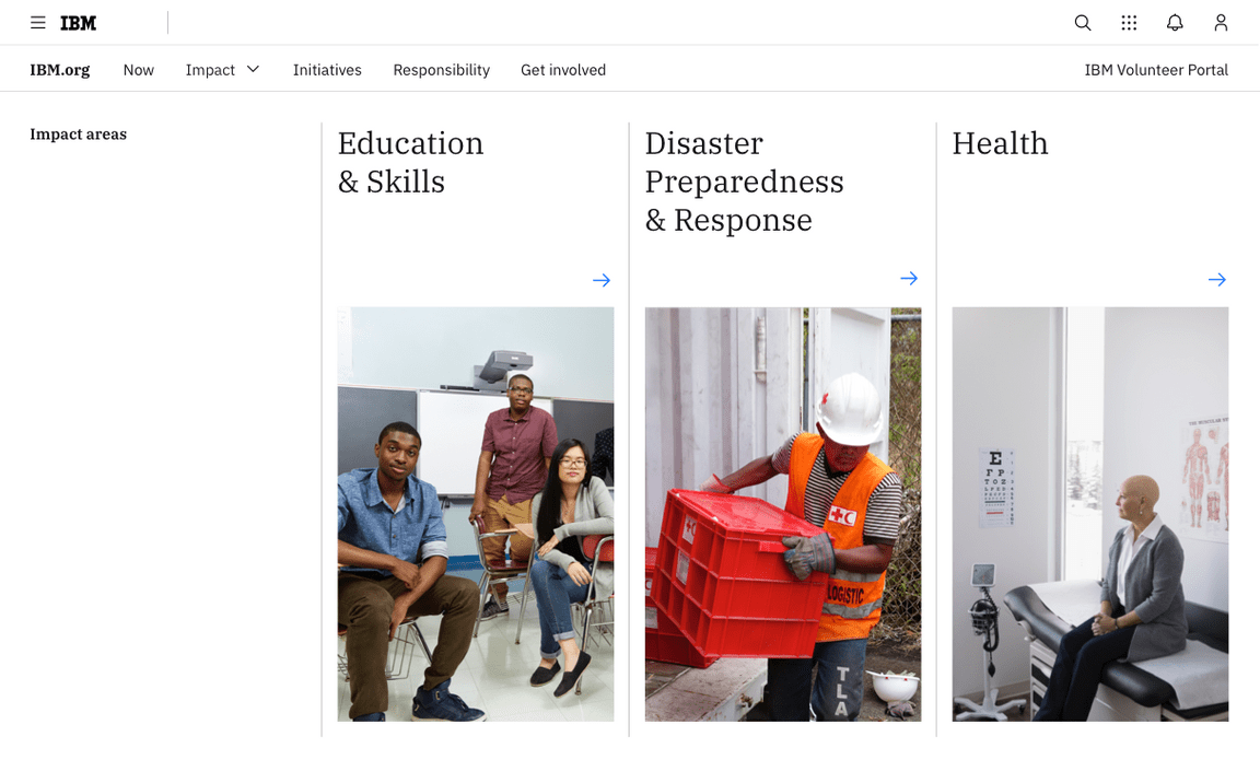
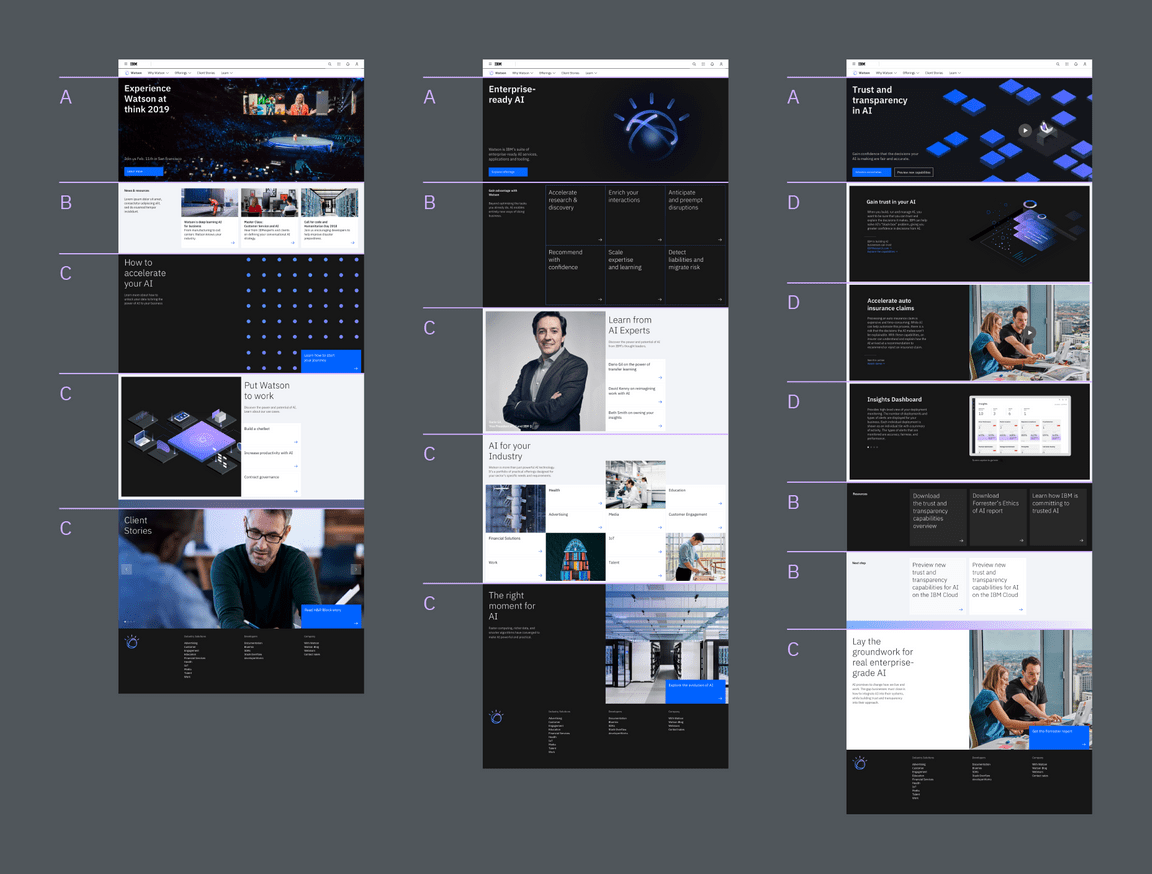
Careful repetition and alternation of larger units of design drives editorial rhythm. This is most often done in multi-page editorial design or scrolling web pages, where the viewer experiences one part of the whole at a time.
The concept is well established in music as form. Musical form describes the structure of a piece of music as a combination of units. Letters are given to the first occurrence of each unit, and the same letter is given to repeated units. In the AABA form for example, A units have similar melodic content as repeated A units, while the B unit offers an alternation to the A units to provide interest.
In design, larger visual units are driven by the content. Similar types of content can be given similar structure, such as the the same spatial dimensions, type sizes and hierarchy, and alignments. Consider how units can be repeated, and conversely, how structurally different units can break up the monotony of repeated ones. Repetition of units across multiple designs drives continuity between them.
Let it breathe
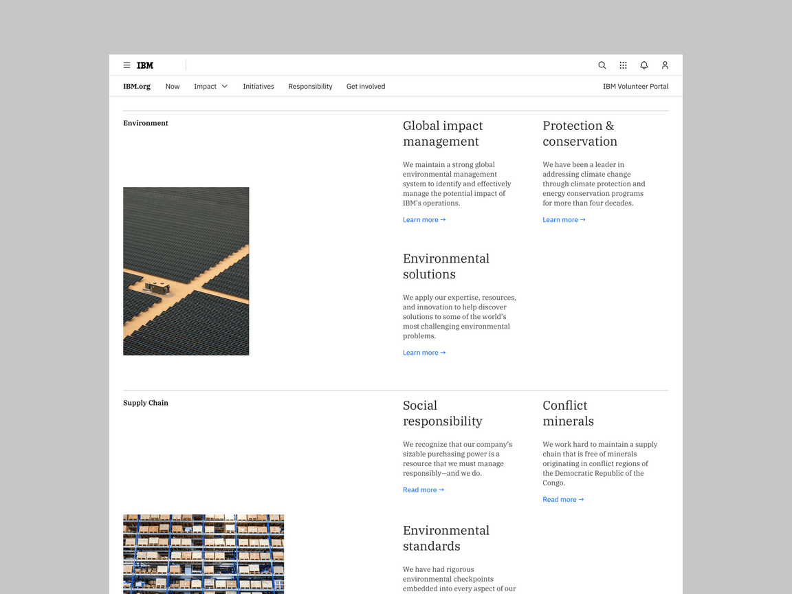
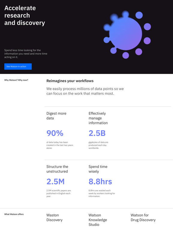
A classic offense that plagues many designers and non-designers alike is the overabundance of elements in a design. While utilizing all available space may reduce canvas size or scroll distance, it does more harm than good when it comes to a viewer’s understanding of information. Overcrowding will render your design impenetrable.
White space creates a visual pause between elements where the eye can rest. It sets things apart or brings them together to distinguish an element’s importance or priority. White space makes a layout feel clean and approachable while maintaining content-rich design.
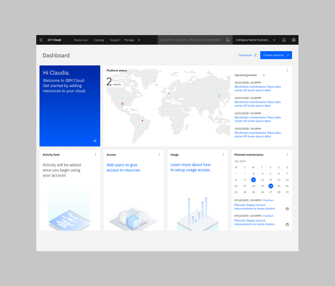
Create breathing room to allow the viewer to consider one thing at a time.
Avoid overcrowded layouts whenever possible.
Guide the eye
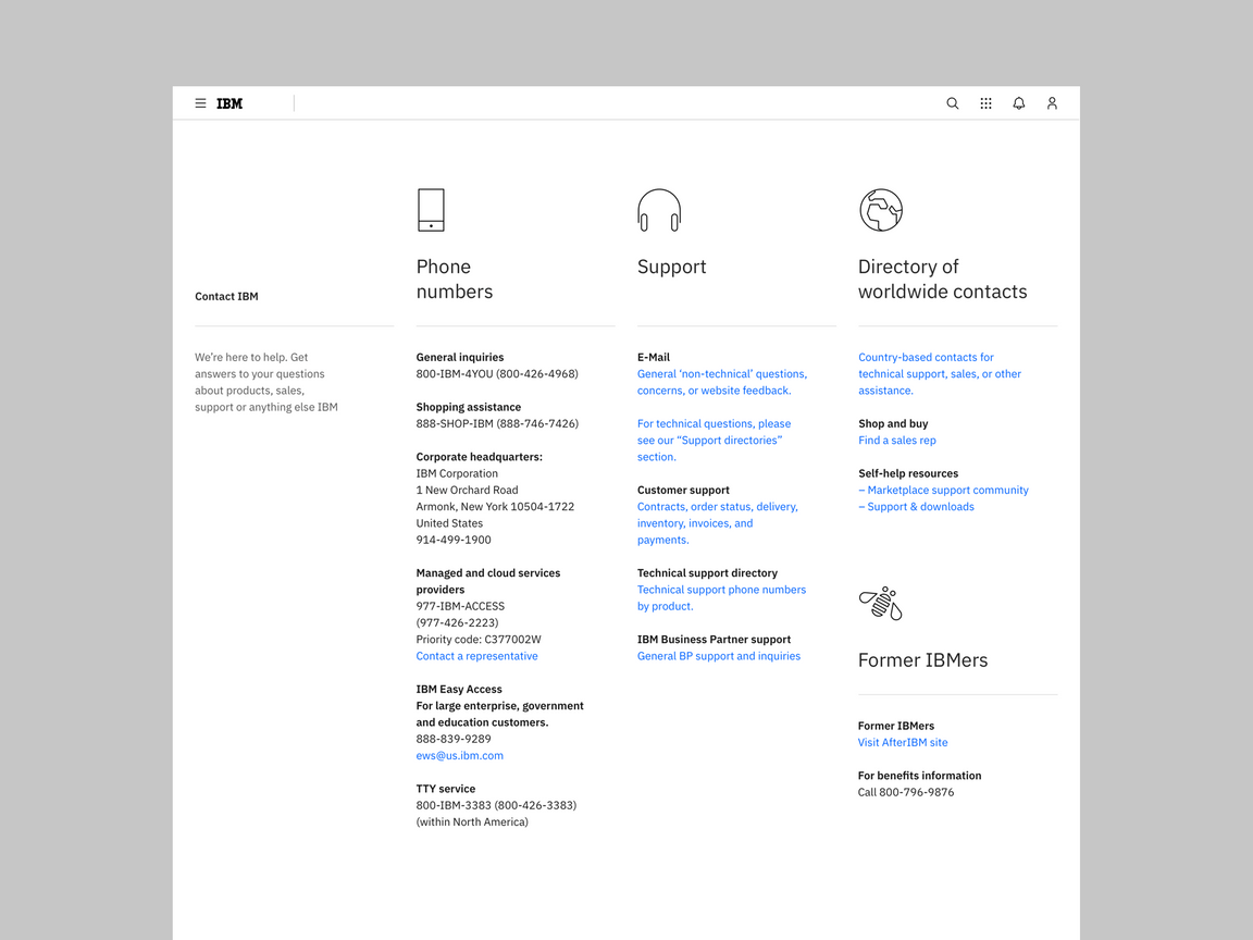
Design is successful when the viewer is guided through a composition via hierarchy. Proper hierarchy creates visual entry points to a design and guides the eye from one element to another in order of significance. Without it, one is forced to discern importance among equally-weighted elements, which leads to a flat design and poor experience.
Hierarchy of information
Typographic hierarchy is the navigational system that renders complex information accessible. Think of a book outline; the size, style, and position of type not only informs what order it should be read, but also describes the parent-child relationships of the content. Effective use of the type scale, along with an understanding of Gestalt principles, will ensure your design can be easily navigated and understood.
Use contrast in typography to define hierarchy of information.
Don’t force the viewer to determine the heirarchy on their own.
Compositional flow
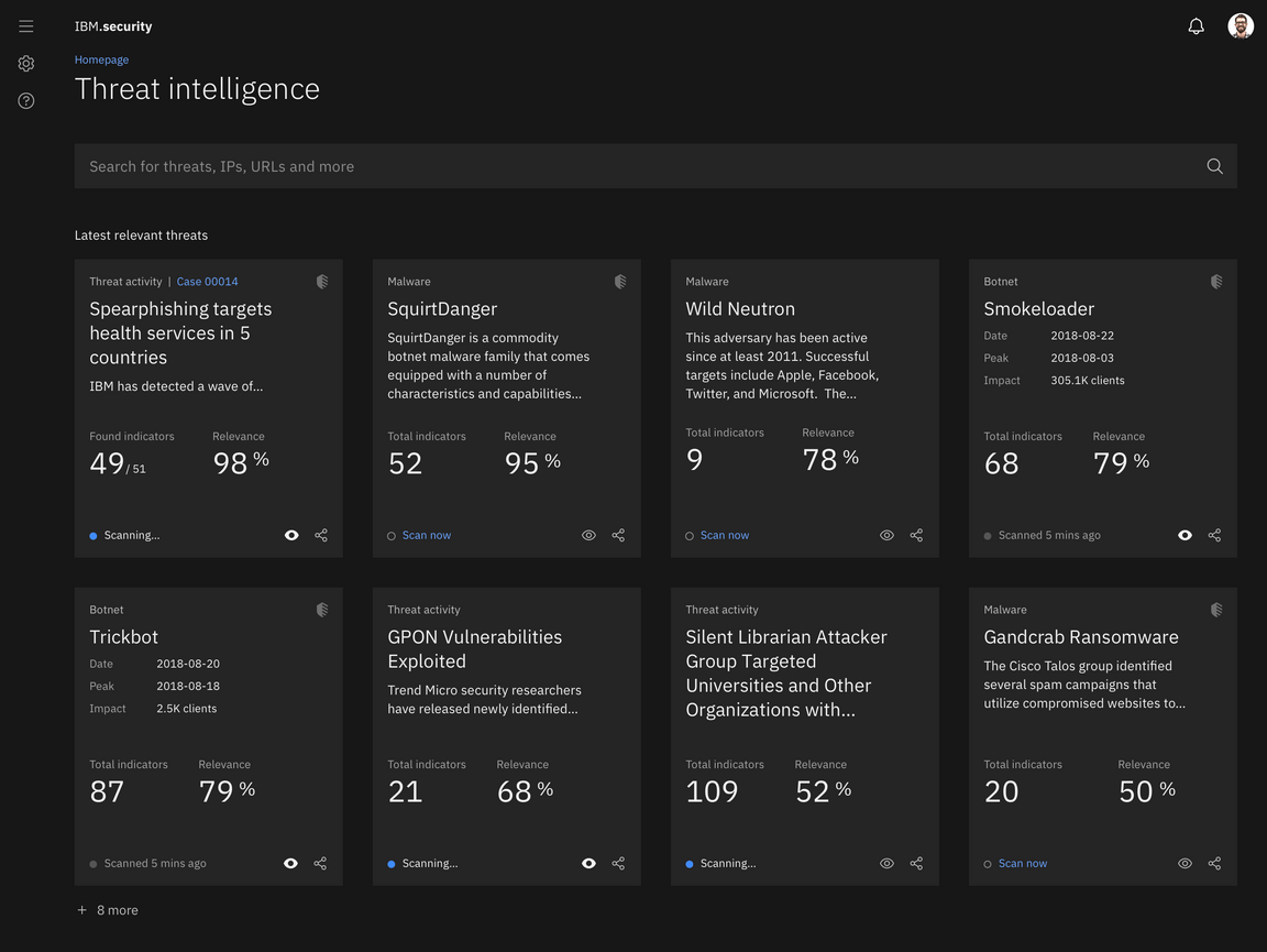
Facilitating eye movement through the composition creates a more interesting design. A focal point instantly attracts the eye to one area of the canvas. Secondary and tertiary elements then draw the eye across the canvas, creating more engagement between the viewer and the design. This is done best through asymmetric layouts, where thoughtful relationships between elements make for a more visually stimulating design. It’s important to plan the movement of the eye in order to guide the viewer to the intended outcome.
Plan the movement of the eye to guide the viewer through the design. Good flow will make the design more interesting.
Avoid uninspired layouts.
Master asymmetry
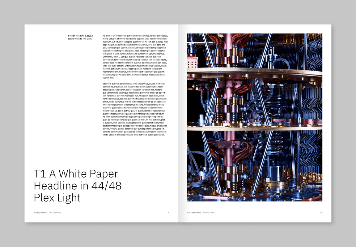
While perfect symmetry can be beautiful and create a sense of stability, it is usually not the best way to create a dynamic composition. Balanced asymmetry is often more successful in creating movement, life, and interest through more creative activation of space. It also requires more careful orchestration of elements to achieve.
Challenge yourself to create a more unique balance of positive and negative space.
Avoid perfect symmetry, it is less engaging.
