App icons
IBM app icons are visual symbols used to represent products or services. They identify apps at a glance for users while serving as a unique expression of our brand.
Overview
App icons visually communicate the core idea of a product or service through either objective or abstract form. Expressive and distinct, each icon serves to identify apps at a glance, while collectively appearing to be part of a whole. All app icons are constructed on the same 32px grid and share many stylistic properties of UI Icons. Several different forms of app icons exist to serve the needs of different products, services, and the contexts in which they appear.

Stroke app icons

Fill app icons

IBM Plex app icons

Hero brands and third-party logos
Stroke app icons
Drawing from the visual expression of Watson, stroke app icons bring in light strokes and color gradients to stand out from product UI icons. Stroke app icons work best in product situations where app icons, UI Icons, and typography appear in the same context.

Style
Stroke app icons are largely based on the styling of UI Icons, following all of the same production guidelines other than color. When creating a stroke app icon, reference the UI icon guidance as a starting point.

UI icon

Stroke app icon
Elements
All stroke app icons consist of three elements: A color gradient, a gradient stroke, and a solid stroke. Each of these elements must appear at least once in the icon, and separate elements do not touch each other.

Color gradient

Gradient stroke

Solid stroke

Gradient strokes and solid strokes do not touch.

Stroke app icons must include both solid and gradient strokes.
Color gradient
The color gradient provides color to the gradient stroke of the icon. This layer remains stationary on the icon grid at 45° and is masked by the gradient stroke for consistent color across each icon.

The color gradient layer remains stationary on the icon grid and is masked by the gradient stroke.

The color gradient is always at 45°.
You can choose between any of the four color gradients below. Note that the colors are adjusted for both light and dark backgrounds to appear best in either context.

Color gradients for dark backgrounds

Color gradients for light backgrounds

Don’t alter the angle or scale of the color gradient.

Don’t use unapproved color gradients.
Gradient stroke
The gradient stroke portion of the icon features an alpha gradient (a gradient that blends between 100% and 0% opacity). This element serves as a mask for the color gradient.


The gradient stroke must include an alpha gradient.

Don’t make the alpha gradient too harsh.

Don’t use radial gradients.

Don’t use gradient horizontally along the stroke to create faded edges.
Solid stroke
The solid stroke features no gradients of any kind, and it is used as an accent or to emphasize a part of the icon. Be purposeful with which part of the icon is comprised of the solid stroke; don’t add emphasis to insignificant parts of the icon.


Don’t add emphasis on insignificant parts of the icon.

Don’t use alpha gradient on the solid stroke layer.
The color of the solid stroke can be either Gray 10 for dark backgrounds or Blue 90 for light backgrounds. These colors work great for either context and with any approved color gradient.

Gray 10 solid stroke on dark background

Blue 90 solid stroke on light background

Don’t use dark theme colors on light theme and vice versa.

Don’t use other solid stroke colors.
Monochromatic icons
In some limited use cases, you may need a single-color app icon. These icons are generally used when the icon needs to appear on a color background or in situations when the icon shouldn’t call attention to itself with color, such as disabled states.

Gray 10 monochromatic icon for background values 60–100

Gray 100 monochromatic icon for background values 10–50

Use monochromatic for app icons on color fields.

Don’t apply color to an app icon on a color field.
Fill app icons
As an alternative to stroke app icons, fill app icons communicate the core idea of the app with more simplicity and abstraction. These icons should focus on the bigger concepts of the product or service, such as scale, transaction, integration and so on. Functionally, fill app icons work best in situations where you need to call attention to the app with more visual weight or a larger color field, as opposed to the light, linear form of fill app icons.

Style
Fill icons are created by combining, intersecting, and subdividing two core shapes: the square and the circle. These shapes can be scaled to fit within the grid to allow for endless possibilities.

Core shape (circle) with subdivisions

Core shape (square) with subdivisions


Avoid making icons too complex.

Avoid making icons too literal.

Don’t use organic shapes.
Elements
Fill icons consist of up to three elements: A primary gradient, a secondary color, and a tertiary gradient. All fill app icons must have at least one primary gradient, and at least one secondary color and/or tertiary gradient. Any element can exist in more than one shape, that is, two separate shapes with primary gradient.

Primary gradient

Secondary color

Tertiary gradient

Fill icons must include at least one shape with primary gradient.

Fill icons must include at least one secondary color and/or tertiary gradient.
Primary gradient
The primary gradient is the primary element of the icon consisting of a blend between any acceptable 2-Color Family from the color palette. Due to the larger color fields possible in fill icons compared to stroke icons, it is possible for a wider range of color gradients to work well on both light and dark backgrounds. Please reference the color guidelines when choosing the right color gradient for your app icon.

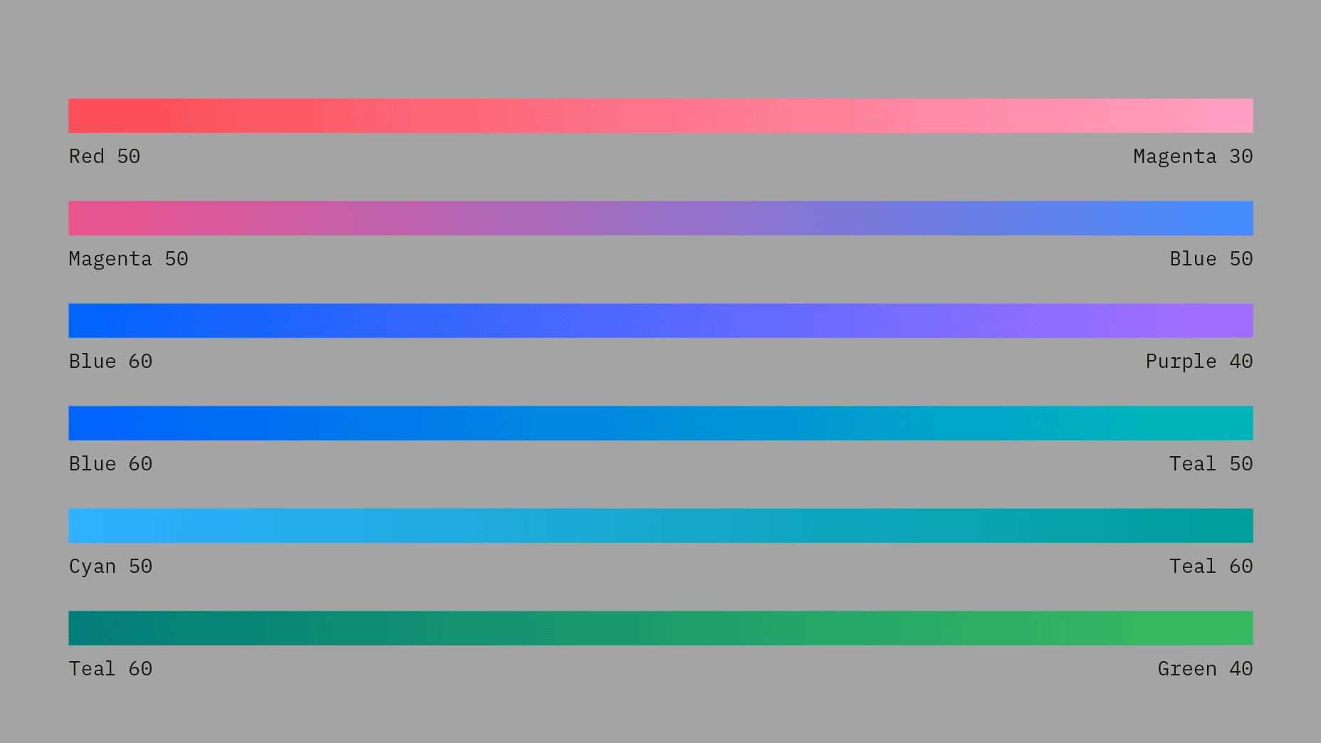
Use combinations within any of the acceptable 2-Color families when blending gradients. Values between 30 and 60 are used to create vibrant gradients that work well against both dark and light backgrounds. For more contrast or subtlety, blend between darker or lighter colors. Do not blend between colors that are more than two steps away from each other.

Don’t use more than one 2-Color Family for the primary gradient.

Don’t use different color values for the primary gradient.

Don’t mix colors that are outside of the accepted 2-Color Families.

Don’t blend between colors that are more than two steps away, for example, Blue 60 to Teal 20.

Don’t create gradients with more than two colors.

Don’t use radial gradients.
Secondary color
Secondary color can be used as an accent or to place emphasis on part of the icon. Use either Gray 10 for dark backgrounds or Blue 90 for light backgrounds.


Gray 10 secondary color on dark background

Blue 90 secondary color on light background

Don’t use dark theme color on light theme and vice versa.

Don’t use other colors for secondary color.
Tertiary gradient
The tertiary gradient is a very light and subtle supporting element designed to fall somewhat to the background. It consists of an opacity gradient using either Gray 10 for dark backgrounds or Gray 100 for light backgrounds.


Tertiary gradient for dark backgrounds

Tertiary gradient for light backgrounds
Monochromatic icons
In some limited use cases, you may need a single-color app icon. These icons are generally used when the icon needs to appear on a color background or in situations when the icon shouldn’t call attention to itself with color, such as disabled states. Fill icons use opacities of a single color to create gradients.

Gray 10 monochromatic icon for background values 60–100

Gray 100 monochromatic icon for background values 10–50

Use monochromatic for app icons on color fields.

Don’t apply color to an app icon on a color field.
IBM Plex® app icons
IBM Plex can also be sized for use as product or service identifiers. Use the icon grid as a guide to ensure type appears clear and proportional alongside other iconography.


Style
For app icons, bold weights of IBM Plex Sans work best. You may choose to use Plex Mono or italics Plex fonts when it makes sense for your product or service.

Use bold weights of IBM Plex and default to Plex Sans.

Don’t use lighter weights.

You can use Plex mono and italics Plex fonts when it makes sense to do so.

Avoid use of Plex Serif.

Use solid type.

Don’t outline type.
Typesetting
When setting type on the icon grid, use smaller type sizes as character count increases in order to fit the type comfortably. Please do not alter other type specs, such as tracking, kerning and vertical or horizontal scale.

Don’t use more than 3–4 characters max.

Don’t use more than one line of text.

Don’t stretch the type.

Don’t alter the tracking.
Alignment
Always keep type center aligned within the icon grid, and adjust for optical alignment when needed. Keep baselines aligned to a grid division and respect icon padding guidelines.

Center typography while aligning the baseline to the icon grid.

Don’t place the baseline off-grid.

You can adjust horizontal alignment when optical centering is needed.

Don’t left, right, top, or bottom align the type.

Use the padding occasionally for optical centering.

Don’t place logos in the padding unless absolutely necessary.

Place type completely within the icon grid.

Don’t crop.
Color
You can use color and gradients with typography. Always choose a color within the palette and follow the color guidelines for gradients.

You can use one color value within the color palette.

Don’t use multiple colors.

You can use gradients across the entire icon.

Don’t place gradients on separate elements of the type.
Hero brands and third parties
Products and services often need to be represented with logos in environments such as marketplaces, especially when it is delivered by a third party or IBM partner company. Placement within the icon grid can help to ensure logos look great alongside other iconography.

IBM Cloud logo

Third party logo

Third party logo within container
Alignment
While most logos don’t align perfectly to the icon grid, it is important to align any icon artwork to the grid as best as possible. Center logos and align edges to grid divisions while respecting icon padding guidelines.

Optically center logos and align to the icon grid as best as possible.

Don’t left, right, top or bottom align logos.

Use the padding occasionally for optical centering.

Don’t place logos in the padding unless absolutely necessary.
Keyshapes
When logos have a background container, use keyshapes to guide your design. This makes it easier to create a visually stable foundation and helps to keep visual weight consistent between icons.


Third-party logo set in circle keyshape

Third-party logo set in square keyshape