Overview
Data visualization is a powerful means to discover, understand and reveal important stories that live within vast amounts of information. To be effective, they need to stand out, be distinctive, be clear and deliver meaning while representing values and numbers accurately. We’ve synthesized a set of criteria that can help you achieve successful data visualization.
Understandable
An IBM data visualization should communicate a message at a glance, in a clear, concise and easy-to-understand way. Avoid elements that make a visualization appear complex, distant or disjointed. You can achieve this effect using established typographic and visual communication principles that enhance the form, readability and meaning. You should remove anything gratuitous and avoid ambiguity or unnecessary embellishments that distract the user from the main concept. Less is more.
Essential
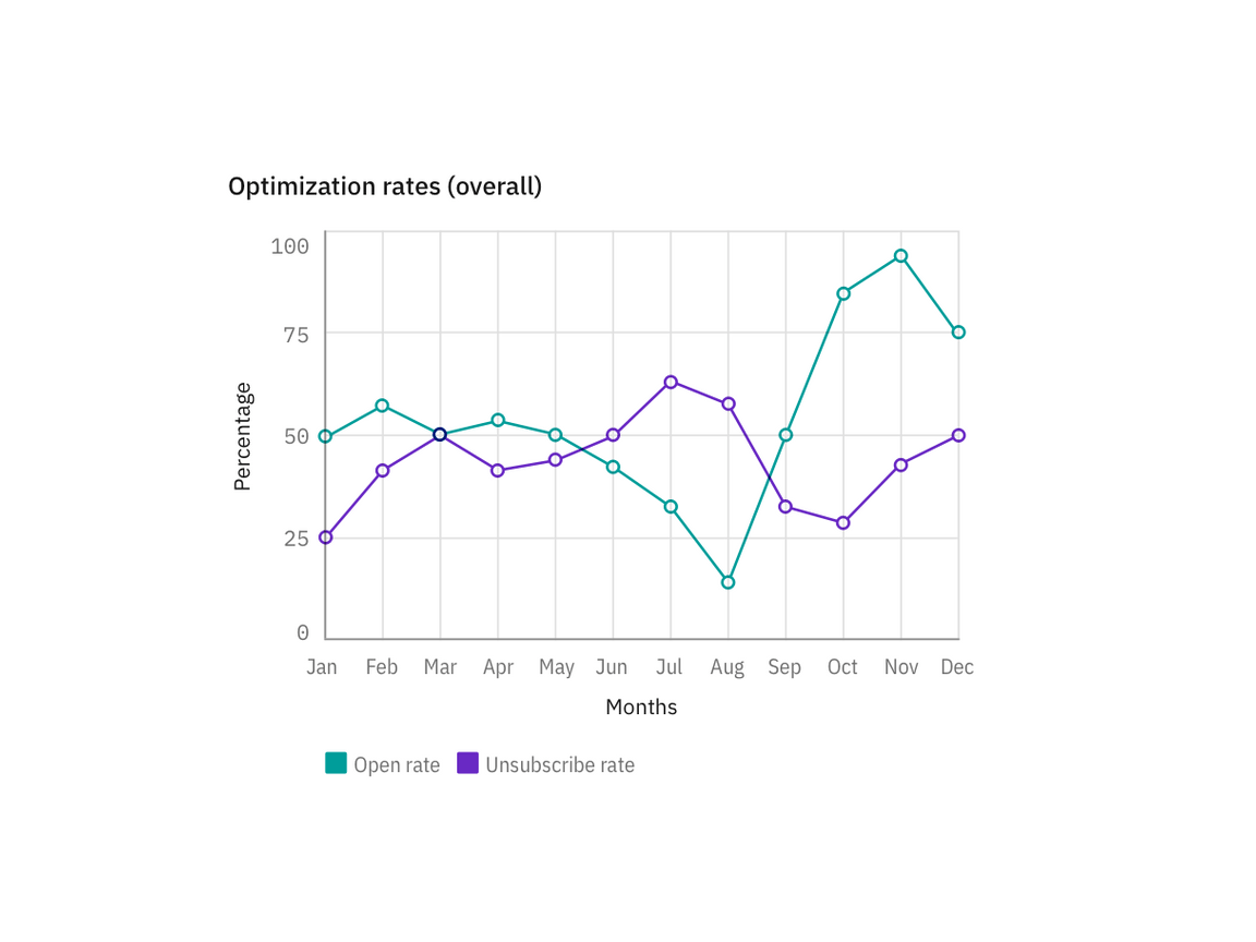
Design is an exercise in decision-making. When you design data visualization, you must consider the utility in answering a question or solving a problem. A definite structure, contrast, rhythm and hierarchy of the information displayed is essential to guide users through complex information. Choose the visual model that best conveys the message. Take a dive into our Charts section to get a better understanding of how to pair your data with the most effective chart type.
Learn more on Carbon.
Basic charts
Impactful
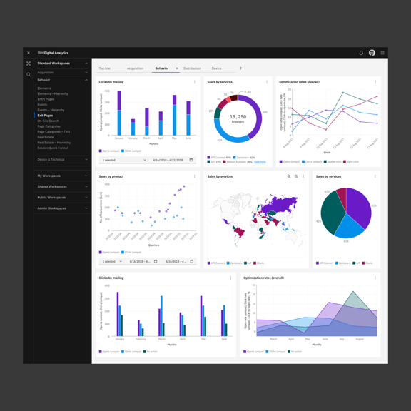
As IBMers, we love celebrating the beauty and creativity of things, but we also invest in showing how things work, conveying concepts and displaying details. Our data visualization should always enable the user to reach the goal and explore the topic in detail by using a clear system of filters, functions and well-known interaction patterns that make the affordance unmistakable. We embrace a love for details and multiple layers of information as part of a good design practice.
Consistent
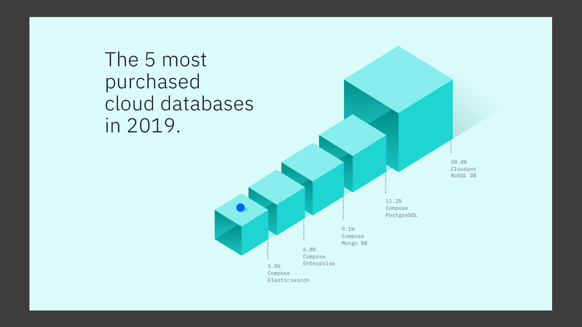
Just as the core values of IBM have remained consistent over the years, similarly, we want our visualizations to be consistent both stylistically and from a data point of view. Be a good storyteller. Ensure each visual representation corresponds to the relative numerical quantity, and pay attention to the proportions and scale of the elements to keep the integrity of the data. A misrepresentation of data could lead to a misinterpretation of reality.
Learn more on Wikipedia.
Misleading charts
Contextual
Learn more on Carbon.
Data visualization
