Rebus
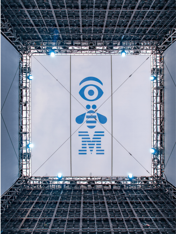
Designed in 1981 by Paul Rand for his Eye-Bee-M poster in support of the IBM THINK motto, the rebus used pictures to represent letters. This rebus is now an iconic part of our visual history and in the permanent collection at the Museum of Modern Art in New York.
Resources
IBM rebus
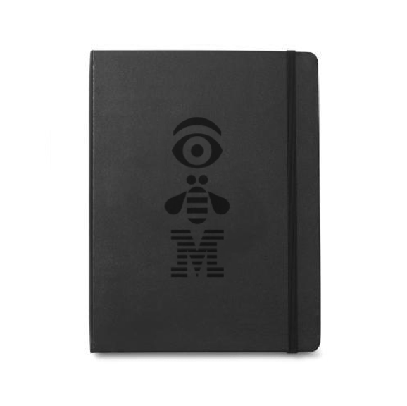
Today we still use the rebus, which has since been adjusted to meet the requirements of different mediums, scales and production environments. Like the 8-bar logo, the rebus comes in positive and reversed versions. The rebus can be used in special applications, such as merchandise, badges and events, but shouldn’t be used in place of the 8-bar logo as an official brand communications sign off.
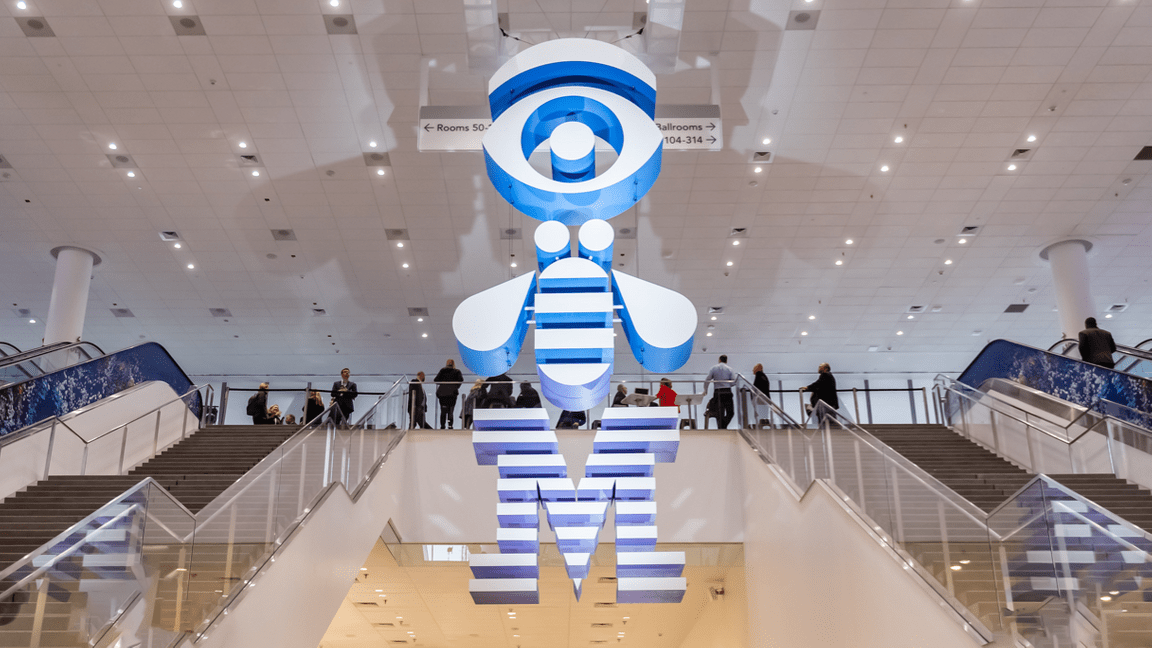
IBM totem rebus
The totem rebus adds more meaning to the already lovable original. The totem connects with us because it speaks to the human factor, the user, and the ever-evolving relationship between mankind and machines. It reminds us that good design should primarily serve people and move us toward progress.
Same scale in vertical relationship
Totem rebus positive
Totem rebus reversed
Rebus and spacing are on a grid
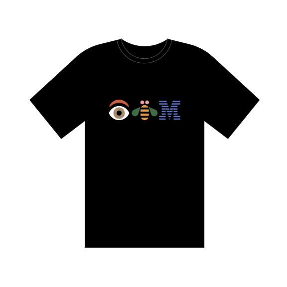
IBM classic rebus
The classic rebus, using the original color scheme, is still used for our heritage merchandise and can also be used for special occasions with permission from the brand team. This special art may only be used on a black background. This color scheme is not meant for standard usage and doesn’t reflect the current IBM brand color palette. So, while the classic rebus is available for restricted use on merchandise or for special events, prior approval is required.
Always use the classic rebus on a black background.
Don’t use the classic rebus on light backgrounds.
Color
The IBM core colors, consisting of the blue and gray families, are used when applying color specifically to the rebus. Please refer to the color specifications for precise values. Here are a few examples of possible color combinations using core colors and positive and negative IBM rebuses.
 Positive rebus
Black / Gray 30
Blue 70 / Blue 20
Gray 60 / White
Blue 50 / Black
Blue 40 / Blue 90
Gray 10 / Blue 60
Background colors
Dark or light background colors work well with the core colors of the IBM rebus. Always use a minimum of five “steps” away between the foreground and background color to insure appropriate contrast and legibility. Any background color from the IDL color palette with sufficient contrast may be used with a core color rebus. Here are a few examples of possible color combinations.
Gray 100 / Blue 20
Blue 70 / Green 10
Blue 80 / Purple 30
Blue 40 / Purple 90
Gray 10 / Teal 90
White / Magenta 60
Usage
The IBM rebus is a special piece of design. The form shouldn’t be altered, adjusted or colored in inappropriate ways. Here are a few samples of what to avoid and what’s permissible. If these basics are adhered to, it will protect the integrity of Paul Rand’s great design work.
Clear space
Keep the rebus and totem rebus separated from other visual elements by a distance equal to the M height. This distance is considered the minimum uninterrupted space surrounding the rebus. We call it the area of isolation, or clear space, and it should be adhered to in most situations.
Misuse
Shown here are a few examples of improper use of the rebus and totem rebus.
Don’t alter the spacing of elements.
Don’t scale or recompose rebus elements.
Don’t stretch or compress rebus elements.
Don’t create compositions from the rebus and the 8-bar logo.
Don’t add drop shadows to the rebus.
Don’t use unacceptable color combinations.
Don’t replace the 8-bar logo with the rebus for sign offs, not even in marketing applications.
Don’t combine the rebus with specific business units.
Patterns
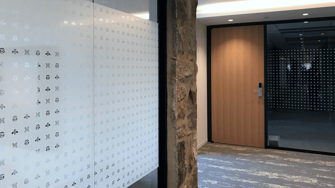
Patterns can be useful tools in a variety of graphic applications. In the workplace for example, distraction patterns on glass walls and doors can prevent injury. Event structure facades might use graphic wallcovering. They can also be used effectively on merchandise. There are a few approved patterns based on the rebus, with positive and reversed options.
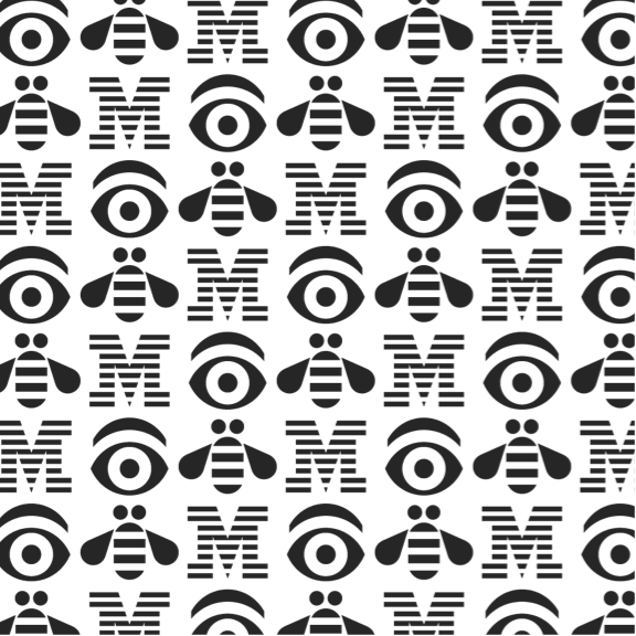
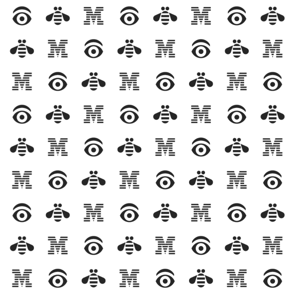
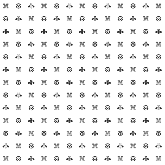
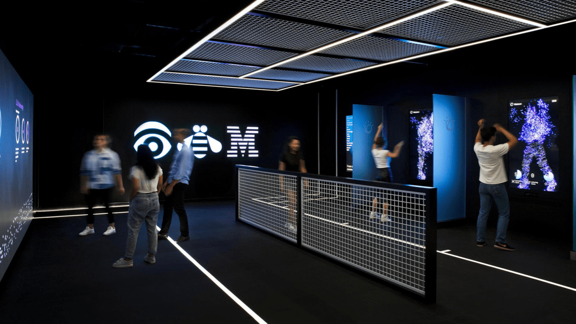
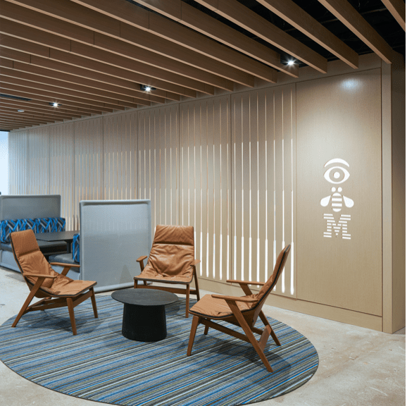
The rebus in action
