8-Bar
The IBM logo is one of our most valuable corporate assets. It’s among the most recognized corporate identities in the world, uniquely distinguishing us from our competitors and other companies. It’s the tangible symbol of our brand, representing everything we are: our expertise, our values, our people, our offerings.
Resources
The 8-bar
Created by legendary designer Paul Rand, the basic design of the IBM logo has remained unchanged since 1972. Its consistent, visible use reinforces the IBM brand, makes it more memorable and authenticates the things to which it’s applied. It’s an essential component of the IBM look—used to lend authority and engender trust wherever it appears. It’s our responsibility to protect it.
Note: The black stripes have been drawn thicker than the white stripes. The black and white should appear to be similar optically.
Reversed 8-bar
The logotype has been adjusted to work well reversed on dark backgrounds. In this case, the white stripes are thinner than the black stripes to adjust for optical differences, but, like the positive version, the stripes should appear similar in weight.
Positive and reversed
In addition to the differences in bar thickness between the positive and reversed versions, there have been adjustments to the points in the counter shape. The positive being a sharp and the reversed more blunt. This subtle difference between the two ensures optical integrity on light or dark backgrounds.
Legal requirements
The IBM logo should appear on every piece of official IBM communication. On printed literature, it generally appears on the front cover, back cover or both. In videos, it generally appears at the end as a final sign off. In the United States, one appearance of the IBM logo, generally the sign off, must be accompanied by the registered trademark. In other countries, local legal counsel should be consulted for trademark guidance. There’s also a copyright statement that should appear in the legal attribution area, which reads: © International Business Machines [insert current year].
Color
The IBM core colors, consisting of the blue and gray families, are used when applying color specifically to the 8-bar logo. Please refer to the color specifications for precise values. Here are a few examples of possible color combinations using core colors and positive and negative IBM 8-bar logos.
 Positive logo
Black / Gray 30
Blue 70 / Blue 20
Gray 60 / White
Blue 50 / Black
Blue 40 / Blue 90
Gray 10 / Blue 60
Background colors
Dark or light background colors work well with core color IBM 8-bar logos. Always use a minimum of five “steps” away between the foreground and background color to insure appropriate contrast and legibility. Any background color from the IDL color palette with sufficient contrast may be used with a core color 8-bar logo. Here are a few examples of possible color combinations.
Gray 100 / Blue 20
Blue 70 / Green 10
Blue 80 / Purple 30
Blue 40 / Purple 90
Gray 10 / Teal 90
White / Magenta 60
Colors to avoid
Don’t apply colors to the 8-bar logo that are outside of the blue and gray families and make sure to adhere to the five “steps” away rule for contrast between the foreground and background. Don’t use unapproved color combinations that have been noted in the IBM color palette guidance.
Don’t use colors that aren’t the core colors for the IBM logo.
Don’t break the five “steps” away rule.
Don’t use unapproved color combinations.
Don’t create stripes using different colors.
Don’t make each letter a different color.
Don’t use a gradient to color the logo.
Usage
Consider these important points when using the logo across a wide range of applications. Careful use and consideration are a requirement to maintain the integrity of the logo in any type of environment or experience. The logo shouldn’t be altered in any way and should always adhere to this usage guidance.
Clear space
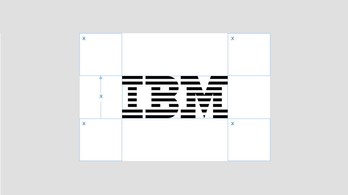
The IBM 8-bar logo should always be clearly visible. Keep the logo separated from other visual elements by a distance equal to its height. This distance is considered the minimum uninterrupted space surrounding the logo. We call it the area of isolation, or clear space, and it should be adhered to in most situations.

Alignment
The IBM 8-bar logo has both horizontal and vertical relationships with the business units and hero brand logotypes. In either axis, the IBM logo is based on the cap height of the logotype or can scale larger by the ratio outlined in the next section that follows. Please make sure to use the appropriate positive or reversed version of the logo.
Scale relationships
The IBM logo has several size relationships with logotypes. These relationships are driven by the cap height of the logotypes and ensure a nice balance with the IBM logo. The logo can “hang” from the cap height or align to the baseline when the logos are placed near the bottom edge of a layout or footer.
Usage on photography
The logo should be carefully placed on photography. Always place the logo on clear and simple backgrounds with plenty of contrast for legibility. Avoid placing the logo on busy or complex backgrounds or images to keep it as legible as possible.

Always place the logo on clear and simple backgrounds.

Always place the logo on backgrounds with plenty of contrast for legibility.

Don’t place the logo on images that don’t provide enough contrast.

Don’t place the logo on busy or complex backgrounds.
Things to avoid
The 8-bar logo shouldn’t be placed into container shapes, altered or embellished in any way. It should only be used in the appropriate colors from the IBM color palette. The following examples reflect only a handful of samples of what not to do.
Don’t change the direction or weight of the bars.
Don’t make a dot matrix.
Don’t extend the serifs to touch each other.
Don’t outline the bars.
Don’t stretch or compress the logo.
Don’t alter the spacing between the letters.
Don’t outline or overlap the letters.
Don’t contain the logo in a shape.
Don’t add the smart rays.
Don’t add characters in the 8-bar design.
Don’t add your own taglines or mottos.
Don’t use drop shadows.
Lineage
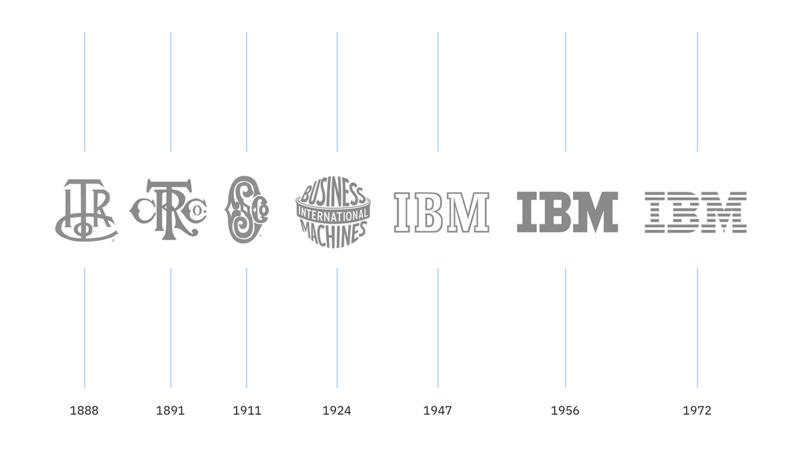
The IBM logo transformed through the years as the business it represents grew. When the company took the name International Business Machines in 1924, the brand evolution of IBM began. The following timeline illustrates its journey.

Co-branding
Co-branding, also called “joint branding,” is when two companies form an alliance to work together to market a related set of products or services that neither company could develop or promote as effectively alone. IBM rarely co-brands and the approval process is rigorous. For more information about the co-branding process, please visit IBM Brand Center.
Third-party logo usage
There are multiple categories of IBM logo use requests we consider to be third party. These requests may come from vendors or organizations that want to market their solutions as enabled by IBM, associations and events IBM has sponsored around the world, or co-marketing requests. Each request is evaluated individually, with the key criteria being appropriateness, clarity of relationship, clarity of ownership of communications or offering, general liability and so on. IBM requires all divisions to comply with these guidelines to ensure a consistent IBM brand identity across all messaging.