Pictograms
IBM’s pictograms are visual symbols used to represent ideas, objects or narratives. They can communicate messages at a glance, afford interactivity and simplify complex ideas. Pictograms draw from details found in the IBM Plex® typeface and work well in presentations and marketing communications.
Resources


The foundation
Draw pictograms on the 32 x 32 master grid to maintain consistent positioning and proportions across the IBM icon set. The Pictogram library is available in the Design Kit and please see the contribute page to contribute your pictogram to the IBM library and/or to receive design feedback.
Base grid
IBM pictograms are drawn on a 32px x 32px base grid. Use the the grid lines as your basic guideline to snap the stroked line-work of your design elements. We recommend making adjustments along the way to make sure to have the right amount of details that work at every size.


Do align center point of stroke to fall on the line of the grid.

Don’t place strokes and points in space between grid lines unless necessary.
Padding
The grid contains 1px padding. This ensures pictograms will retain their desired appearance when exported. Only extend artwork into the padding for additional visual weight when necessary.


Do treat padding as a safe zone for overflowing strokes.

Don’t place design elements on the outer edges of the safe zone.
Style
The stylistic conventions of IBM’s pictograms deliver meaningful metaphor through simple line art. Each symbol is intentionally designed to harmoniously pair with IBM Plex™. The juxtaposition of smooth curves and sharp angles is central to IBM Design.

Rounded exteriors with 90° interiors


Slab characteristics and square terminals


Distinctive points on tips


Rounded caps for obvious metaphors and objects

Strokes
One pictogram should not look heavier or lighter than other pictograms of the same size. Maintain the same visual weight by using a 0.72px stroke when designing all pictograms.


Do use 0.72px for all stroke weights.

Don’t use inconsistent stroke weights
Perspective
IBM Design pictograms are designed and ready to use. Never distort pictograms and be sure to avoid dimensional representations. Use more objective vantage points that are straight-on or profile views.

Do depict objects straight on.

Don’t create pictograms with perspective.
Corners
Use the default rounded corner setting for all shapes and a consistent corner radius of 2px for round shapes. The 2px radius can be increased by a multiple of two when necessary to make the pictogram’s metaphor clear. Use an additional radius to make the metaphor reflect the real form of the object.


Do always use rounded corners as a default stroke style.

Don’t use sharp exterior corners unless a metaphor depends on it.

Do square the tips of arrows.

Don’t use rounded arrow tips.
Angles
Use 45° angles for even anti-aliasing whenever that angle is logical or use increments of 15° for all other angles. You can create harmony across the pictogram set by making angles sit on the same increments.


Do use multiple of 15° or an angle that best represents the metaphor when necessary.

Don’t use 45° angles exclusively for all icons. It won't work.
Details
Pictograms are more illustrative than UI icons but should not be overly detailed. Communicate your ideas with only the most essential elements. Avoid using perspective and unnecessary visual metaphors.

Do use thoughtful metaphors. Create depth through flat layers and essential details.

Don’t use cliches or perspective views. Small details will not scale down well.

Don’t combine pictograms or elements unless contributing a new pictogram

Don’t duplicate or manipulate artwork to create effects.

Don’t scale other pictograms to combine or use different stroke weights
Color
Pictograms are illustrative and can be used at larger scales, therefore a wider variety of visual styles are acceptable. They are by default a solid, monochromatic color but may be treated in four distinct styles: black or white, monochromatic color, tinted or shaded color, and gradient. Regardless of style, pictograms need to pass the same color contrast ratio as typography (4.5:1). For more information on color, see IBM Design Color Usage.

The grid system and guidance allows for diverse solutions.

Pictograms can be treated in four distinct styles.

Use background color values of 70–100 to achieve luminosity.
Backgrounds
Pictograms on backgrounds must always pass color contrast requirements. When pairing pictograms with backgrounds, follow color family rules to ensure that the pictogram does not clash with or blend into the background. Dark background colors should range between values 70–100 while light backgrounds should not exceed values 10–20.


Do follow the 5-step color rule and only match tones from the same color family or use grayscale backgrounds.

Do follow gradient rules when placing them on backgrounds.

Don’t place dark tones on dark backgrounds.

Don’t place light tones on light backgrounds.

Don’t use gradient picto’s on backgrounds that are not 70 and above or 20 and below.

Don’t place gradient picto’s on gradient backgrounds.
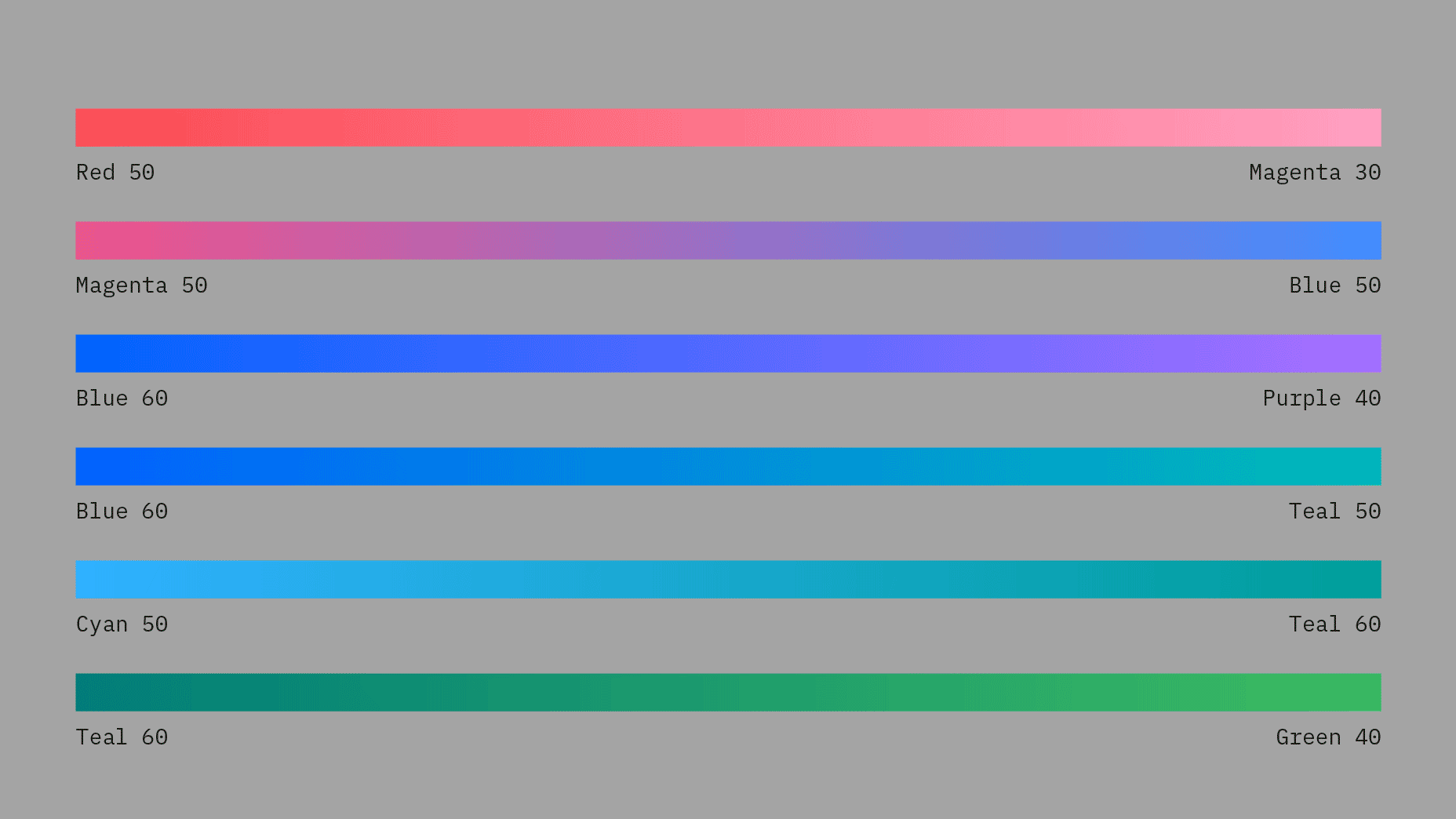
Gradients
Use combinations within any of the acceptable 2-Color families when blending gradients. Values between 30 and 60 are used to create vibrant gradients that work well against both dark and light backgrounds. For more contrast or subtlety, blend between darker or lighter colors. Do not blend between colors that are more than two steps away from each other. For more information on color, see the gradient sections on IBM Design Color Usage.


Do follow color gradient usage and only use accepted gradient color families.

Do use 45 degree angle when applying gradients.

Don’t mix colors that are outside of the accepted 2-Color Families.

Don’t blend between colors that are more than 2 steps away, i.e. Blue 60 to Teal 20.

Don’t create gradients with more than two colors.

Don’t use radial gradients.

Don’t add glow effects to pictograms
Tints and Shades
Adding color by tinting or shading your pictograms can give a deeper feeling of expression and tonality. One to three-color families can be used when coloring pictograms, though single-color families are recommended. On light backgrounds (white or value 10) use tints 1 to 2 steps up from the background color to fill in pictograms. On dark backgrounds (black or value 100) use shades 1 to 2 steps down from the background color. Be sure to follow color contrast rules for pictogram strokes so the original metaphor can communicate properly.


Do follow the 5 step rule when using 1, 2, or 3-color families to color and shade pictograms.

Don’t use tones that are not accessible or alert colors.

Don’t use colors outside approved color families or tones outside the 5 step rule.

Don’t use more than 3-color families when shading pictograms.

Don’t shade or mix colors outside the accepted color families.

Don’t resort to realism when coloring and shading pictograms.